Table of Contents
Introduction
Our shiny app has now been released!
As part of the research project we wish to build a visualisation tool to provide overview and insights into the trends and distributions of academisation and educational inclusion in England. We build this visualisation tool using these amazing technologies:


![]()
In this blog post I will walk through the design of the shiny app and discuss the major features of the app.
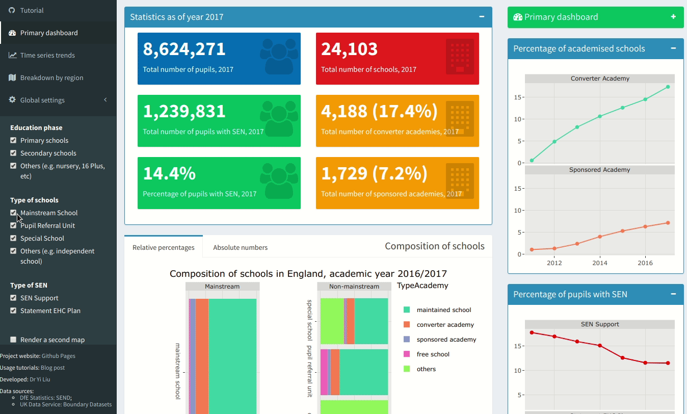
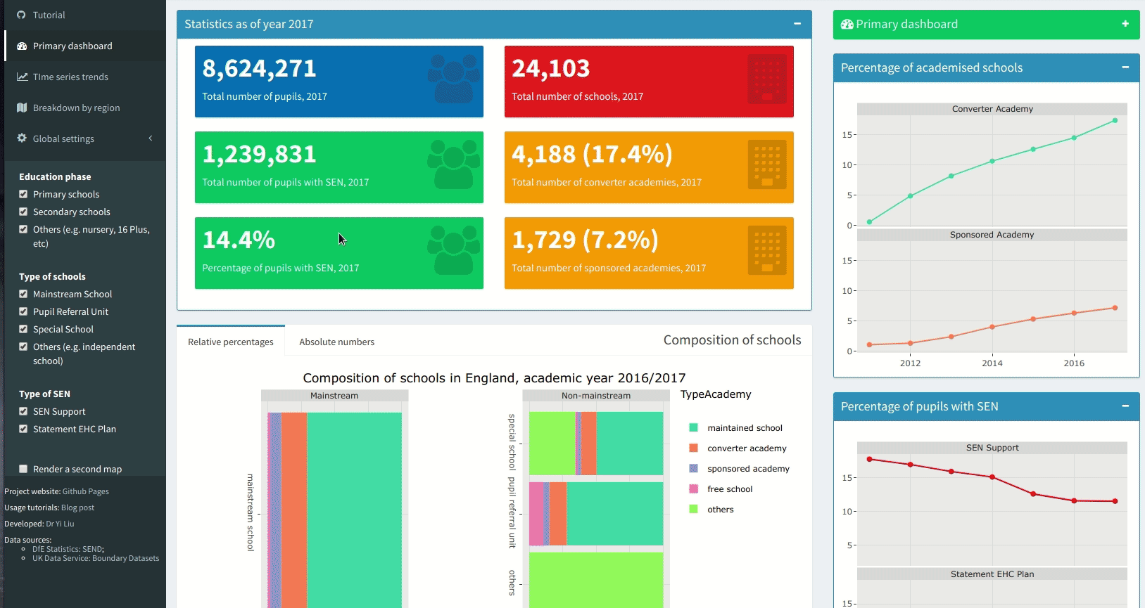
Topic 1: Primary dashboard
The primary dashboard is intended to provide a quick overview of the
statistics, and
this is the default view you see when you visit the Shiny app:
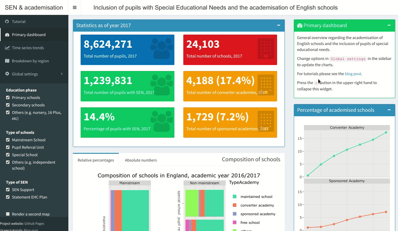
Settings in the Global settings can be used to update the statistics in
the dashboard (you can also navigate to other topics using this sidebar):
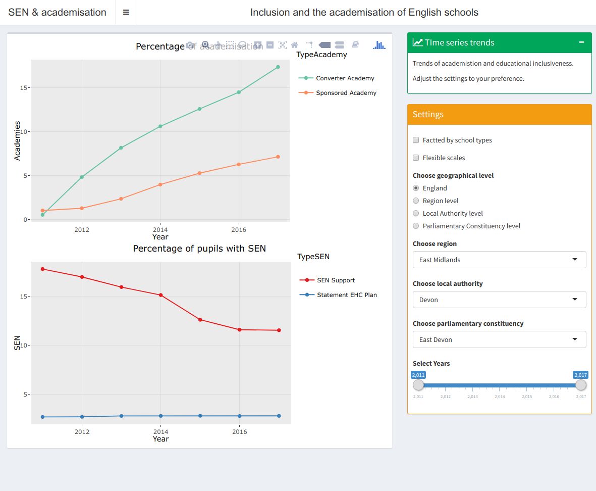
Topic 2: Time series trends
The second topic aims to provide more details about the trends of
academisation and educational inclusion over the sample periods.
By default the plots shown are for all England, and
using the settings you can limit the time series plots to
Region / Local Authority / Parliamentary Constituency level respectively.
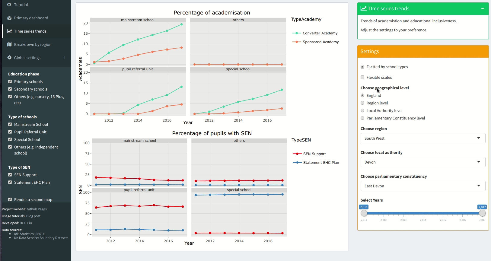
Untick Facetted by school types will display the plots for all
school types.
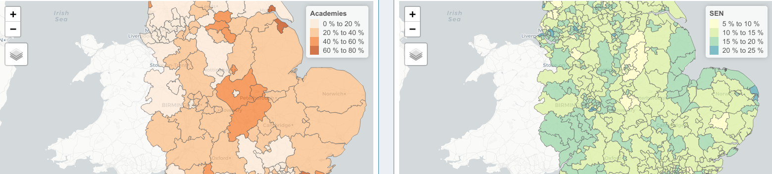
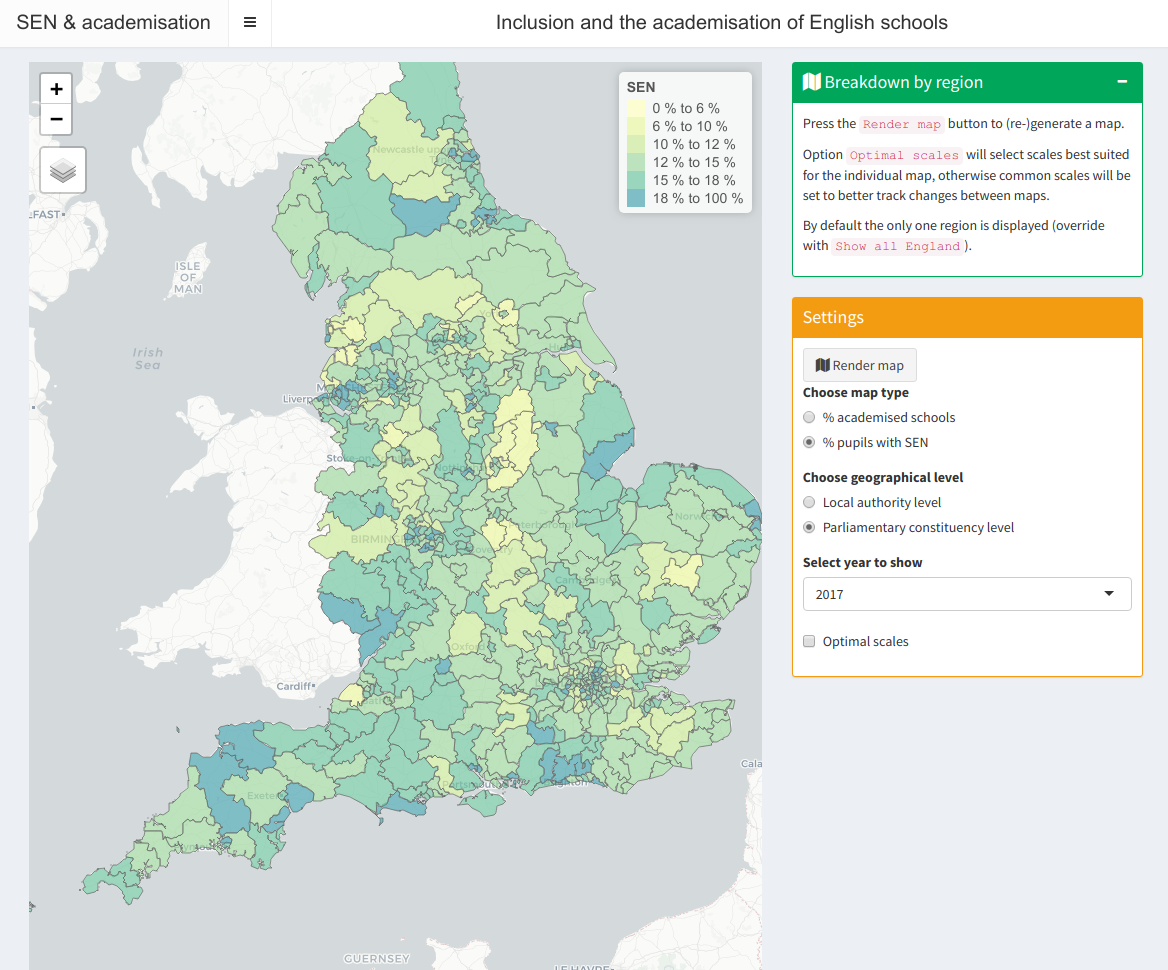
Topic 3: Breakdown by region
The third topic provides in depth view to regional breakdowns of
academisation or educational inclusion.
By default you will see an empty map as the map is not initialised yet, and
clicking Render map will render a map on academisation or
educational inclusion:
You can choose the map to be rendered on Local Authority level (default) or
Parliamentary Constituency level:
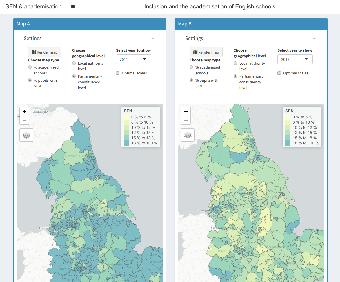
Dual map mode!
This is done by ticking Render a second map in Global settings.
Using dual map mode you can compare regional breakdowns of academisation
and educational inclusion side by side:
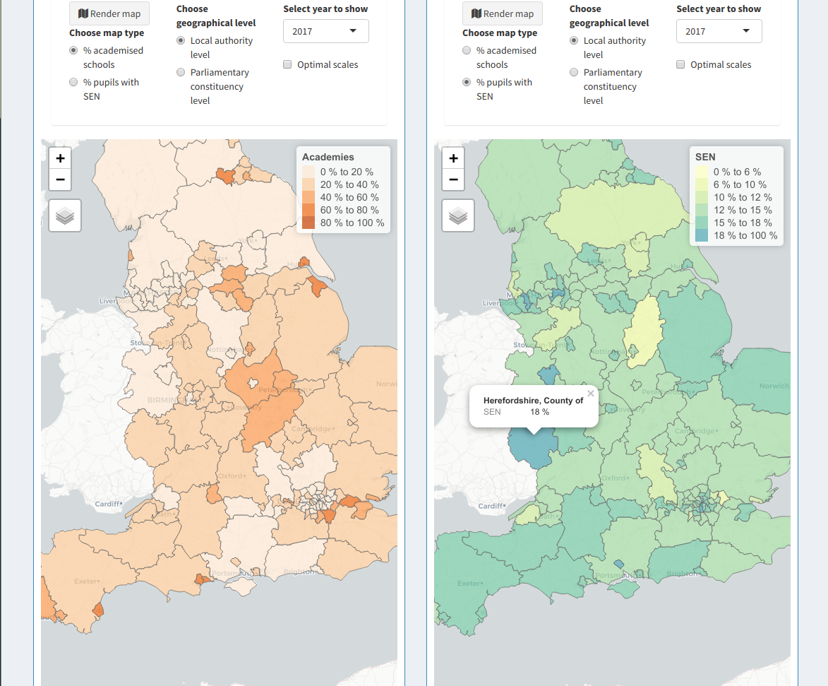
Or compare the same breakdown from different time periods:
Check out this Shiny app here!